A New Year, A New Website
First and foremost, please forgive me. While Publications professionals is very much an editorial services company, not all of us are editors. For example, your current writer is our Senior IT Support. Thanks to Barb, my command of the English language is excellent when spoken. When written, well, that’s another story. Barb tends to twitch when she sees my punctuation choices. But, this is one of the perils of working for a professional editor. Did I mention her full-time staff of wordsmiths? It’s like they’re all listening. All the time in here! If I’m on the phone, and I make a bad grammatical choice, someone shouts the correct usage down the hallway. Totally not kidding! Seriously, these amazing women are the gatekeepers of the English language. As the parlance of our times might say, “It’s so their thing.” My point remains the same though. While they have the English language on lock-down, being our IT minion, I don’t hold myself to quite the same standard. Whenever I choose to post something, please don’t proofread me?
Anyway, yes. I just write the code, fix the fonts, install the updates, run the backups, keep the internet working, make sure the phones function, fly the email system, and so on. Of note, if you call our offices, my voice is the hold music. Seriously. I really do exist. And apparently I’m talented. Wait… whats that they say about someone with a face for radio? Or is it a voice for radio. I cant remember. Moving on.
Over the years, PubsPros has had multiple logos. Barb initially worked out our “Two P’s” logo, which we kept for many years. At the turn of the century, she asked for a redesign. I was happy to oblige. A colleague and I spent a laborious evening hashing out the new logo all while loudly arguing about the movie “Howard The Duck” amidst a plethora of white russians. This was our second logo. We affectionately call it “The Postage Stamp.”
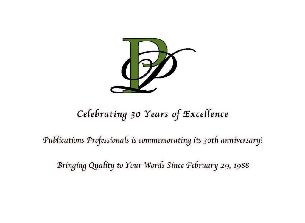
As this past year rapidly approached, I began playing with the letter P again. It had been a decade. I knew the company was moving to new digs, and that meant a rebranding, and a rebirth of our existence. After much yelling at my computer (or Illustrator, rather), I came up with a close approximation of our current logo. Barb liked it, and we tweaked it until we had it the way we liked it. It is now, what our logo is. I quietly call it my “Intertwined P’s.”
At the same time, our website wasn’t perfect. Our first attempt in 2003 was the victim of my initial hatchet job with Dreamweaver. Other folks were given the opportunity to take a stab at it, but nothing really materialized. We were so busy with so many things, that it just was not high on the list. But like a splinter in my brain, I kept toying with it. Two years ago, we brought up a newer, much more fluid website, running on a stronger and more functional back end. But, some jerk out there in internet-land managed to insert code into my XML that caused our Google returns to populate with viagra ads. Seriously. Who clicks on that stuff anymore? Can there possibly be any money in SPAM? I wanna meet the person who thinks that stuff is legit. Then I wanna lock them in a room with a walrus and two tons of….Ahem. Sorry. Getting back on track.
Long story short, my code lay broken and battered. I scooped it up and quietly buried it in the backyard. I then set to work building, well, this. A new year, and a new PubsPros.com. It isn’t finished. It isn’t perfect. Pardon my mess. As I make progress, Barb and Linda are sending me tons of corrections and tweaks. They’re also adding content. This is a never ending cycle. I’d like to think that someday, It’ll be “done.” But such a state is a myth. Someday, I’ll be lucky to be “satisfied.”
So check us out. PubsPros is quite a company. When it comes to the english language (printed, digital, carved in wax tablets), the women I work for are about the best there is. And I’m not just saying that because they locked me in the server closet.
Cheers!
JH